Monday, October 15, 2012

on my own

Tell why you think these items/places/people are so interesting and unique. In all honestly, I don't find this place interesting or unique. To me, it's all old and cliche. I took these photos when I was sitting on a bench after walking around and being tired. Just kind of pointing and shooting gave me a pretty cool angle. I think they are stronger together as a set.
What drew you to them? Different angles.
How do they make you feel? Blah.
Have you ever seen anything like it before? Yup.
Why did you choose it? After changing the colors and angles and adding effects, they turned out better than I thought. I'd like to use a third one and create a set of three.
Who/What does it remind you of? Just downtown buildings. Nothing special really.
Tell why you think these items/places/people are so interesting and unique. Over the summer, my best friend made me watch all the superhero movies. So seeing these creepy manikins looking out the window, I knew I could create something intense and movie-like from them. I thought i was pretty successful. 
What drew you to them? Aside from my best friend loving superhero movies, my swim coach, Conner, also loves Batman. So that's pretty funny.
How do they make you feel? Super.
Have you ever seen anything like it before? Yea, in comic strips and movies.
Why did you choose it? They're cool-looking.
Who/What does it remind you of? My best friend and my swim coach.
Tell why you think these items/places/people are so interesting and unique. Lianne and Megan are two of my best friends. I care a lot about them and value their friendship. It is for this reason that I chose to photograph them. Also, they're both stunningly beautiful.
What drew you to them? They both were aware that I'm not a fan of the Third Ward, but they still managed to make my day worthwhile.
How do they make you feel? Happy.
Have you ever seen anything like it before? YUP. Everyday.
Why did you choose it? Because they're my friends and I spent the whole day with them.
Who/What does it remind you of? Lianne and Megan.
Tell why you think these items/places/people are so interesting and unique. I loved the bold colors--they're funky and pop-arty.
What drew you to them? Their colors.
How do they make you feel? Fun.
Have you ever seen anything like it before? Yup.
Why did you choose it? I chose them because they weren't old and third-wardy.
Who/What does it remind you of? My sock drawer.

inspiration

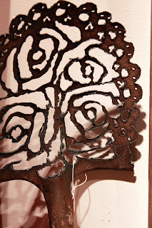
The Katie Gingrass Gallery was mostly filled with overpriced paintings, jewelry, dog collars, shoes, etc. However. I managed to find a few items, of similar style, that stood out to me. These shovels and wheelbarrows have been cut-out with extravagant patterns and designs and I thought they were really beautiful. I'm inspired to find something average and turn it into something art-worthy. Who doesn't need a giant, cut-out wheelbarrow int their bedroom or living room, right?


third ward gallery assignment


What attracted you to this piece? I really loved their use of color in the background and the undefined lines that make up the face shape. Another aspect of this work that I found interesting was the multiple mini-paintings that were used as practice before the final.
Describe the elements and principles of design you saw present in the work. This piece features rule of thirds by the off-set placement of the face. Also, it has contrast between the cool colors of the background and the warmth of the face/hair.
What is the strongest thing about the work? I think the sense of color is really strong throughout the work. Also, her eyes really draw you in, so it captures the viewers attention really well.
What is the least effective thing about the work? The background could have been more elaborate, or there could have been more of the actual portrait visible.
What is the title of the artwork? No title available. I believe these were just portraits.
Who is the artist? See photo above.
What media was used? Watercolors.


What attracted you to this piece? The bold colors attracted me to the first piece, and the message--specifically the word "unapologetically"--stood out to me in the second.
Describe the elements and principles of design you saw present in the work. Contrast of colors is present in both. Rule of thirds is more predominant in the first, where as leading lines stands out in the second.
What is the strongest thing about the work? I absolutely adore the message in the second piece. I think it was designed with great visual strength. In the second, I thought it was quite clever to make the garbage into fish.
What is the least effective thing about the work? As much as I love the second piece, I think there is too much white space left.
What is the title of the artwork? Principles of Screenprinting.
Who is the artist? Tyanna Bule
What media was used? Screenprinting.

What attracted you to this piece? All the doodles :)
Describe the elements and principles of design you saw present in the work. Fill the frame and contrast of lines allow for organized chaos.
What is the strongest thing about the work? Everything going on in this piece keeps your eyes busy.
What is the least effective thing about the work? Maybe its monochromatic color pallet...but I don't really think anything about this piece is weak.
What is the title of the artwork? Doodle Days.
Who is the artist? Jeremy Pettis.
What media was used? Digital.


What attracted you to this piece? Bold colors!
Describe the elements and principles of design you saw present in the work. I loved the leading lines and the complementary color choice of the heart and brain cut-out. The bold color choice also created beautiful contrasts in the silhouette landscapes.
What is the strongest thing about the work? I found this pieces really easy to relate to. The constant battle between heart and head is very well known, being a teenage girl :P The second two silhouettes symbolized the sun setting on my childhood days/years. Left me with a bittersweet feeling.
What is the least effective thing about the work? Nothing :)
What is the title of the artwork? Foundations. Visual & Color Dynamics.
Who is the artist? Lynn Tomaszewski.
What media was used? Paint.

ALL ARTWORK WAS CREATED BY STUDENTS/STAFF OF MIAD.